
Holed up at Truth Coffee shop, the entrepreneur's haven in Cape Town, I was seated across from a pair of business women talking shop. Their topic of conversation? The website of a small business owner who was pitching to their company. And what they had to say stopped me typing mid-sentence.
“Businesswoman #1: She sounded really clued-in and I liked what she had to offer. So in the meeting, I brought up her website on my phone. And oh my god.
Business woman #2: What? Was it horrible?
Business woman #1: It was all over the place! It was obviously not designed for phones. I mean, how can you work with someone whose website isn’t even mobile responsive?”
Wow. Pretty harsh, I thought. But then again, this is the mobile-age. Everything on the web is being accessed by phone, and if you're not prepared for that, you're not going to succeed in business.
More than 20% of Google searches are now performed on a mobile device, says this Huffington Post article by John Rampton, and mobile users now exceed desktop users. But businesses still haven't picked up on the mobile responsive trend.
Why is that? Well, one reason is a lot of websites were built before or at the start of the smartphone revolution. And let's be honest, it costs a lot of money to design and launch a website. For a small business, the idea of doing it again can be a huge financial headache.
But the truth is, you're more likely to damage your business if you don't upgrade, says Rampton.
"Whenever someone arrives on your mobile website and is frustrated, or doesn’t see the content that they are searching for immediately, there’s a 61% chance they will leave and head to another website," he says.
"And 48% of users stated that when a site doesn’t function on their mobile device, it makes them feel that the company does not care for their business."
Put simply, a customer who can easily navigate your website on their smartphone or tablet is going to stick with you. If they can't, you're going to lose that customer. Or in the case of the small business those women were chatting about, you're going to lose a big client.
Mobile responsive is an industry term that pretty much means "designed for digital." It means that a website looks as pretty on an iPhone and tablet screen as it does in the Chrome browser. And more importantly, it means a website is just as easy to use.
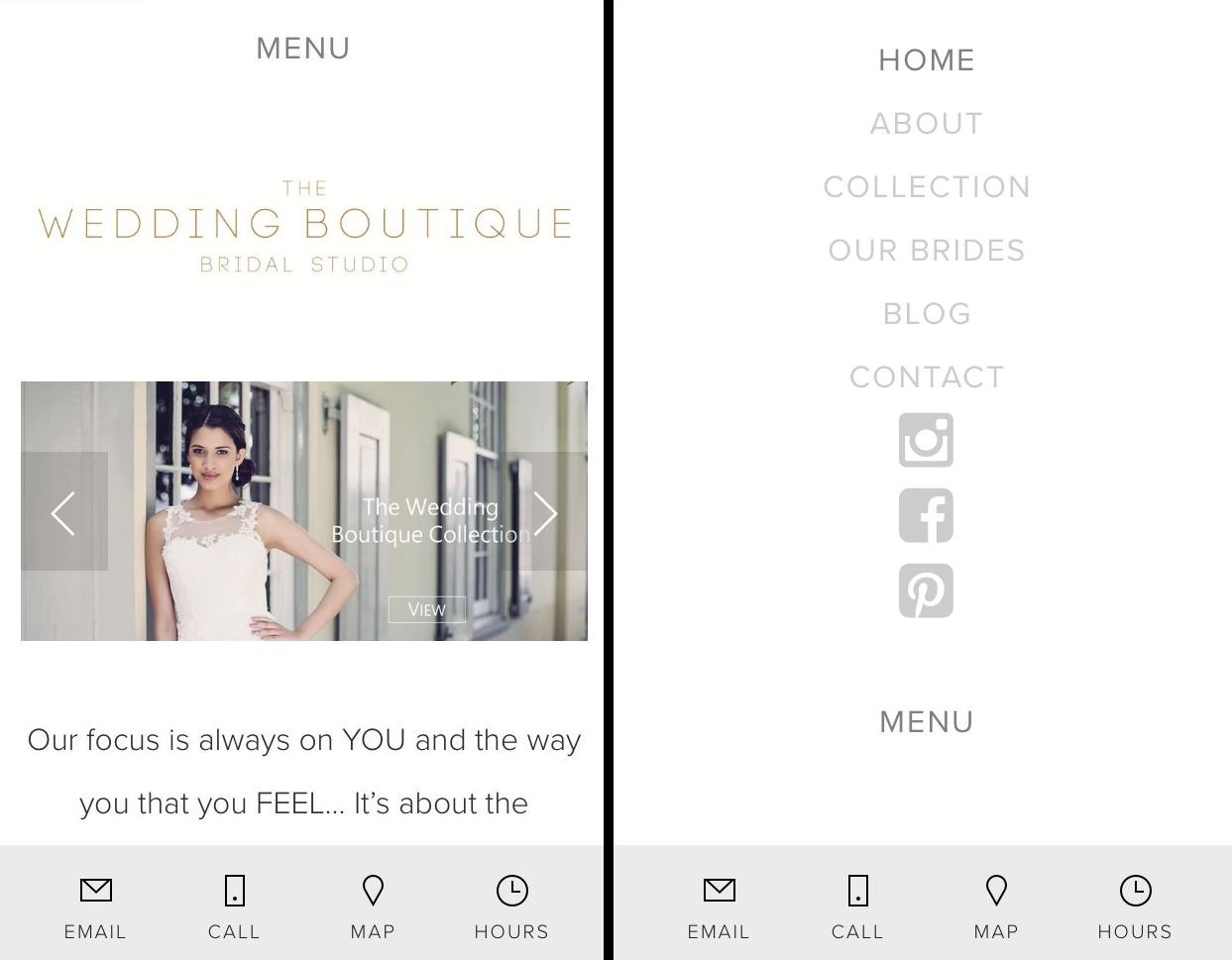
Take, for example, the mobile responsive website we built for The Wedding Boutique. The homepage is attractive and fits well into the mobile view. The menu bar is clear and easy to navigate, and it's easy to click to call, email or get directions and opening hours.
Now, look at this example of non-mobile responsive design. The homepage is crowded, difficult to read and the font is incredibly small (ie. not designed for mobile readers). Also, the menu bars are far too small to work easily at the tap of a finger.

Taking these two examples into account, it's pretty easy to see why mobile responsiveness matters. What's more, this digital-savvy design actually translates into results, according to Rampton.
"I redesigned my personal company site to have a responsive design," he says. "My mobile conversion (people contacting me) tripled overnight as well as people coming to my site doubled."
Customers and potential clients want to see that you're prepared for them - whether they're coming to you on a computer, a smartphone or a tablet. Is your website ready?